


السلام عليكم أحباب مدونة زوم ويب اليوم وفي هذا الموضوع أقدم لكم طريقة تغيير شكل الترقيم داخل مواضيعك على مدونتك بالبلوجر إلى أشكال كثيرة وجذابة أنصحك بإضافة أي تنسيق لأنها ترسم طابع رائع على موقعك كما تلهم زوار مدونتك وتشجعهم نوعا ما إلى تصفح مواضيعك ...
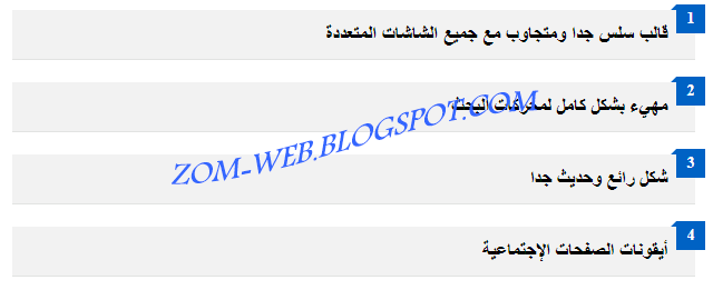
التنسيق الأول :

طريقة تركيب التنسيق الأول :
- من مدونتك قم بتوجه إلى لوحة التحكم
- ثم إختر ''المظهر''
- ثم إضغط على ''تحرير html''
- ثم قم بوضع الكود التالى فوق هذا الوسم : ]]></b:skin>
/* CSS ol li */ .widget .post-body ol li { line-height: 1.8 !important; font-size: 14px; position: relative; display: block; padding: .4em 1.75em .4em 2em; margin: 0.3em -10px; background: rgba(238, 238, 238, 0.55); color: #444; -webkit-border-radius: .3em; transition: all .5s ease-out; width: 92%; } select#selectnav1 { display: none; } .widget .post-body ol li:before{ content: counter(li); counter-increment: li; position: absolute; right: -25px; top: 50%; margin-top: -1.3em; background: #797979; height: 2.5em; color: #fff; width: 2.5em; line-height: 33px; border: .3em solid rgb(255, 255, 255); text-align: center; font-weight: bold; -moz-border-radius: 2em; -webkit-border-radius: 2em; border-radius: 3em; -webkit-transition: all .3s ease-out; -moz-transition: all .3s ease-out; -ms-transition: all .3s ease-out; -o-transition: all .3s ease-out; transition: all .3s ease-out; } .widget .post-body ol li a{ color: #444; } .widget .post-body ol li:hover:before{ -webkit-transform: rotate(720deg); -moz-box-shadow: 0 0 10px #0f3,0 0 30px #0f3,0 0 50px #0f3,0 1px 3px #000!important; color: #444; } .widget .post-body ol li:hover{ background: #eee; color: #444; } .widget .post-body ol{ counter-reset:li; list-style:none outside none; font-size:15px; padding:0; margin-right:20px; margin-top:0; margin-bottom:0 } .widget .post-body ol{ list-style:none outside none; font-size:15px; } .btn-btn2 { display: table; margin: 0 auto; }
ثم قم بالحفظ
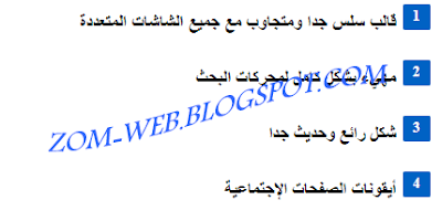
التنسيق الثاني :
طريقة تركيب التنسيق الثاني:
- من لوحة التحكم إضغط على ''المظهر''
- ثم على "تحرير html"
- ثم قم بوضع الكود التالي فوق هذا الوسم ]]></b:skin>
.post ol{counter-reset:li;list-style: none;*list-style: decimal;margin-right:0;padding-right:0}.post ol li{position:relative;margin:0 15px 20px 0 !important;padding:4px 10px 4px 5px !important;list-style:none;*list-style: decimal;border-bottom:1px solid #e2e3e2;background:#f2f2f2;text-indent:14px;}.post ol li:before { background:#0062c4; color: #fff; content: counter(li, decimal); counter-increment: li; font: bold 14px serif; margin: 0 0 10px; padding: 5px 3px !important; position: absolute; right: -9px; text-align: right; text-indent: 6px; top: -5px; width: 20px;}.post ol li:after { border-color: transparent #0062c4 transparent transparent; border-style: solid; border-width: 5px 5px 0 0; content: ""; height: 0; position: absolute; right: 17px; top: -5px; width: 0;}
#0062c4 هو كود اللون الأزرق تستطيع إستبداله بأي لون تريد
موقع أكواد الألوان : http://gsul.me/au8R
التنسيق الثالث :
 طريقة تركيب التنسيق الثالث:
التنسيق الثالث :

- من لوحة التحكم إضغط على ''المظهر''
- ثم على "تحرير html"
- ثم قم بوضع الكود التالي فوق هذا الوسم ]]></b:skin>
.post ol{counter-reset:li;list-style: none;*list-style: decimal;margin-right:0;padding-right:0}.post ol li { list-style: none outside none; margin: 0 15px 10px 0 !important; padding: 4px 10px 4px 5px !important; position: relative; text-indent: 14px;}.post ol li:before { background:#0062c4; border-radius: 2px; color: #fff; content: counter(li, decimal); counter-increment: li; font: bold 14px serif; margin: 0 0 10px; padding: 4px 4px 5px 3px !important; position: absolute; right: -9px; text-align: right; text-indent: 6px; width: 20px;}
ثم حفظ
التنسيق الرابع :

طريقة تركيب التنسيق الرابع:
التنسيق الرابع :

طريقة تركيب التنسيق الرابع:
- من لوحة التحكم إضغط على ''المظهر''
- ثم على "تحرير html"
- ثم قم بوضع الكود التالي فوق هذا الوسم ]]></b:skin>
.post ol{ counter-reset: li; list-style: none; *list-style: decimal; font: 13px 'trebuchet MS', 'lucida sans'; /* font size of each element */ padding: 0; margin-bottom: 4em; text-shadow: 0 1px 0 rgba(255,255,255,.5); font-weight: bold; } .post ol li{ position: relative; display: block; padding: .4em 3.4em .4em 4em; margin: 0.5em 0; text-decoration: none; border-radius: 0.3em; transition: all .3s ease-out; } .post ol li:hover:before{ transform: rotate(360deg); } .post ol li:before{ content: counter(li); counter-increment: li; position: absolute; top: 50%; right: 7px; margin-top: -1.3em; height: 2em; width: 2em; line-height: 2em; color: #fff; background: #F44336; border: .2em solid #fff; -webkit-box-shadow: 0 8px 5px -7px #888; -moz-box-shadow: 0 8px 5px -7px #888; box-shadow: 0 8px 5px -7px #888; text-align: center; font-weight: bold; border-radius: 2em; transition: all .3s ease-out; }
ثم إضغط على حفظ

محول الاكوادإخفاء الابتساماتإخفاء ركن الاسئلنة